
A kitchen can look expensive without using the most expensive materials. The right kitchen colors, coordinated cabinets, countertops, backsplash, lighting and hardware can create a polished and high-end appearance. In 2026, warm neutrals, natural wood tones, muted greens, deep blues and carefully used dark accents are among the strongest choices for an upscale kitchen.
If you are choosing expensive-looking kitchen colors, focus on balance rather than following a single trend. A warm white kitchen with natural wood, a sage green kitchen with cream accents, or navy cabinets with a light countertop can all create a sophisticated look when the finishes work together.
Table of Contents
What Colors Make a Kitchen Look Expensive?
The colors that can make a kitchen look expensive include warm white, cream, greige, natural wood, sage green, navy blue, charcoal and carefully used black. The most upscale kitchens usually combine one dominant neutral with natural-looking materials, subtle contrast, coordinated hardware and good lighting.
The key is not simply choosing a “luxury” colour. How the colour works with the countertop, backsplash, flooring, sink and lighting determines the overall appearance.
8 Colors That Make a Kitchen Look More Luxurious
1. Warm White
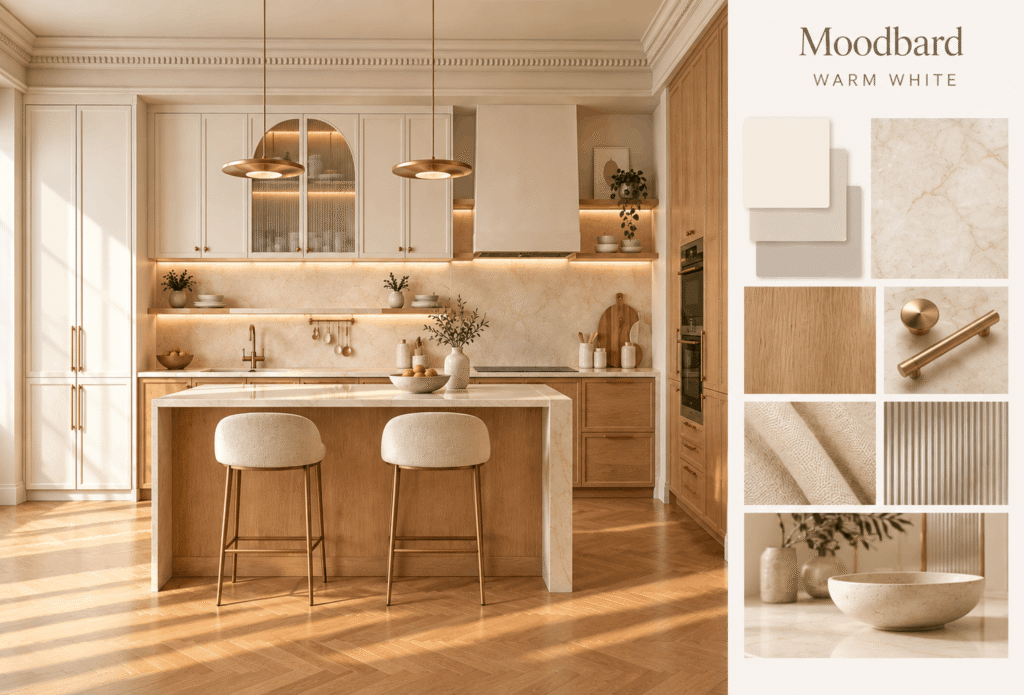
Warm white is one of the most versatile luxury kitchen colors. Unlike a very stark white, it has subtle warm undertones that make the kitchen feel welcoming while maintaining a clean, premium appearance.
A warm white kitchen works particularly well with:
- Natural wood cabinets or accents
- Quartz or marble-look countertops
- Stainless steel appliances
- Brass or brushed gold hardware
- Natural stone backsplashes
For small kitchens, warm white can also help the space feel brighter and more open.
2. Cream and Off-White
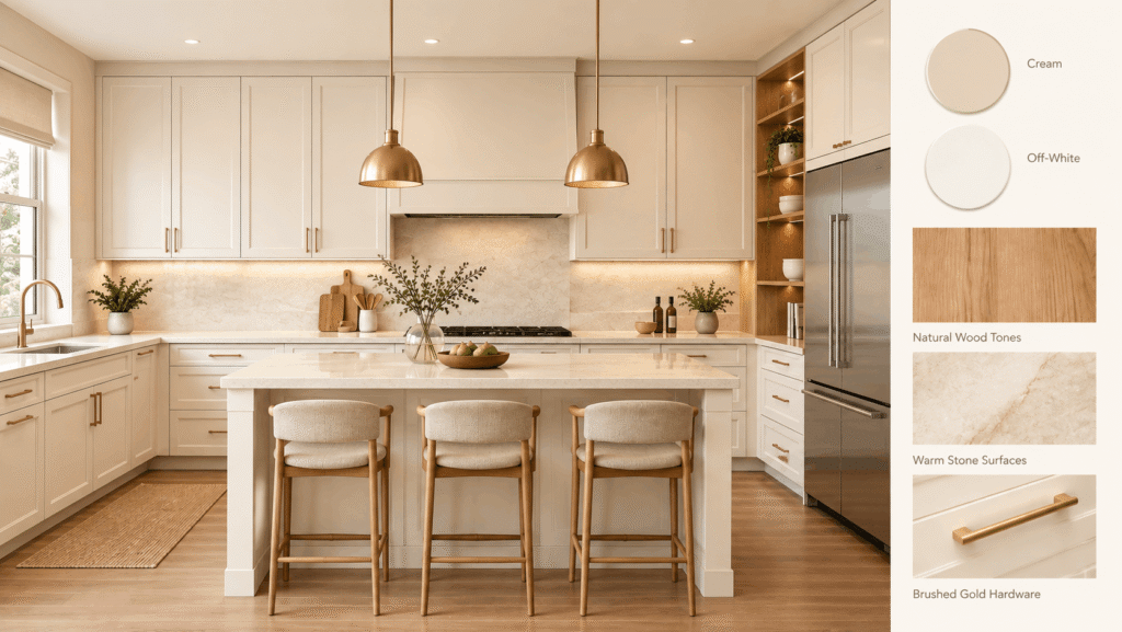
Cream and off-white are excellent choices for an elegant kitchen because they create warmth without looking overly colourful. Creamy white cabinets can give traditional, transitional and contemporary kitchens a softer appearance than bright white.
Pair cream cabinets with natural wood tones, warm stone surfaces or brushed gold hardware for an understated high-end look.
3. Greige
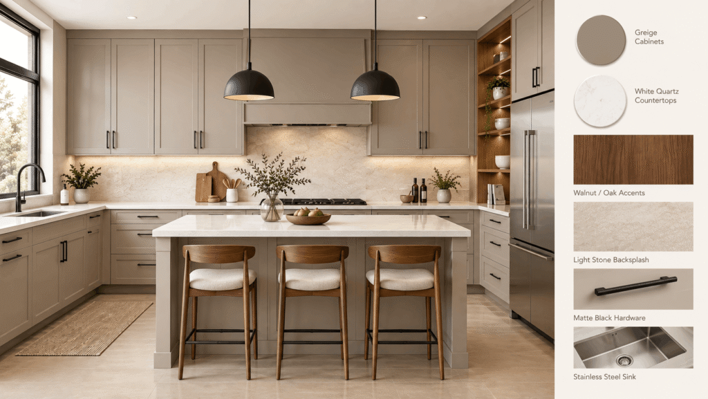
Greige combines the qualities of grey and beige, creating a versatile neutral that works particularly well in modern kitchens.
A greige kitchen can look sophisticated because it adds more depth than plain white while remaining easy to coordinate with other materials. It works well with:
- White quartz countertops
- Walnut or oak accents
- Light stone backsplashes
- Matte black hardware
- Stainless steel kitchen sinks
Greige is also a strong option when you want a modern colour without choosing a dramatic dark shade.
4. Natural Wood Tones
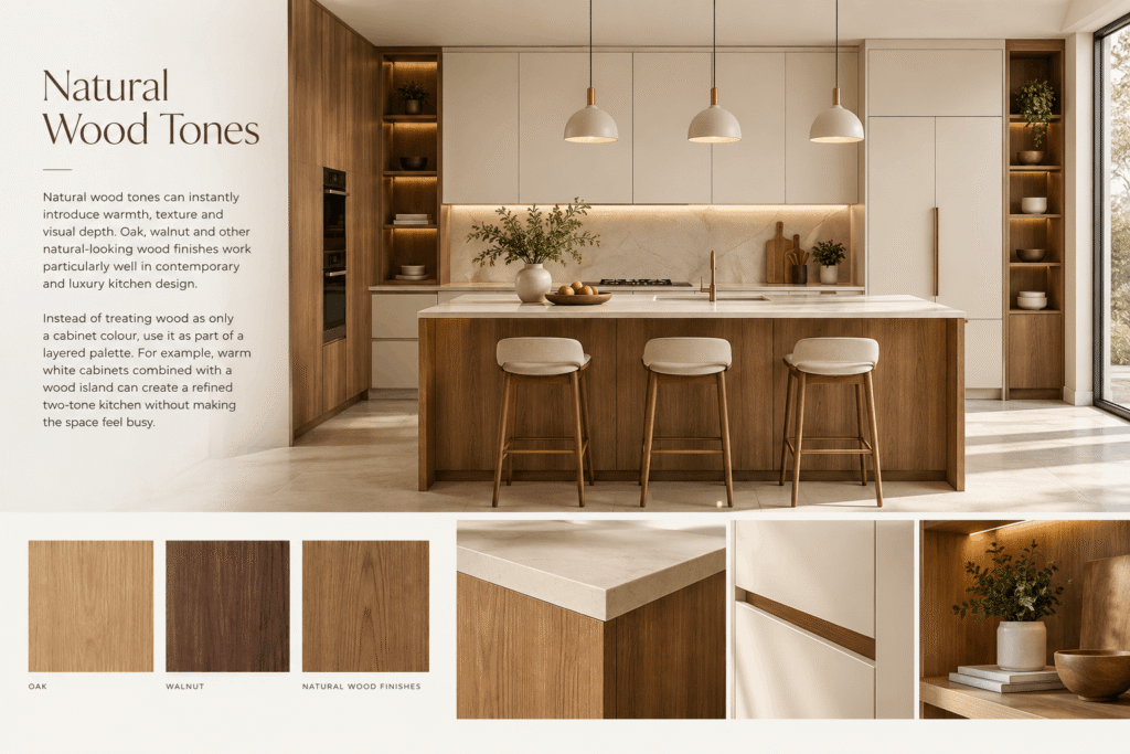
Natural wood tones can instantly introduce warmth, texture and visual depth. Oak, walnut and other natural-looking wood finishes work particularly well in contemporary and luxury kitchen design.
Instead of treating wood as only a cabinet colour, use it as part of a layered palette. For example, warm white cabinets combined with a wood island can create a refined two-tone kitchen without making the space feel busy.
5. Sage Green
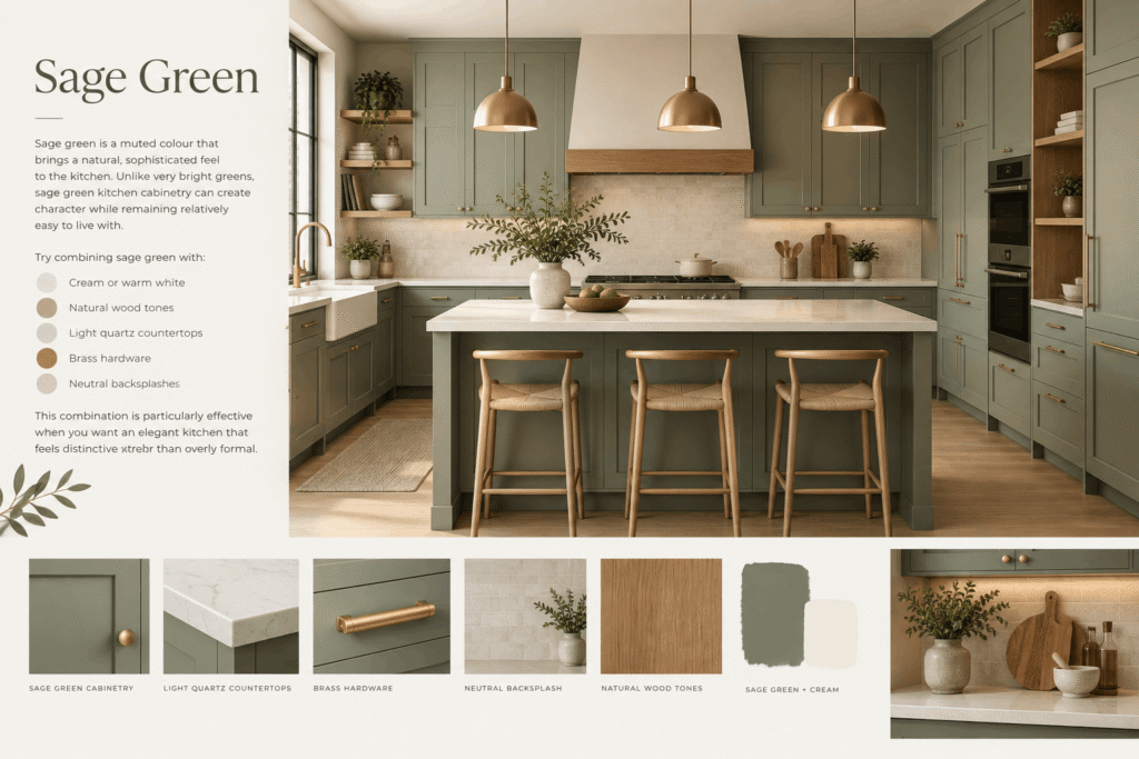
Sage green is a muted colour that brings a natural, sophisticated feel to the kitchen. Unlike very bright greens, sage green kitchen cabinetry can create character while remaining relatively easy to live with.
Try combining sage green with:
- Cream or warm white
- Natural wood tones
- Light quartz countertops
- Brass hardware
- Neutral backsplashes
This combination is particularly effective when you want an elegant kitchen that feels distinctive rather than overly formal.
6. Navy Blue
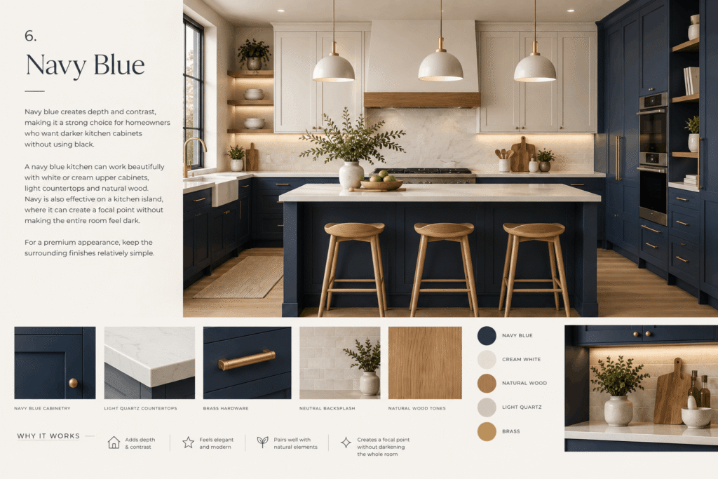
Navy blue creates depth and contrast, making it a strong choice for homeowners who want darker kitchen cabinets without using black.
A navy blue kitchen can work beautifully with white or cream upper cabinets, light countertops and natural wood. Navy is also effective on a kitchen island, where it can create a focal point without making the entire room feel dark.
For a premium appearance, keep the surrounding finishes relatively simple.
7. Charcoal Gray
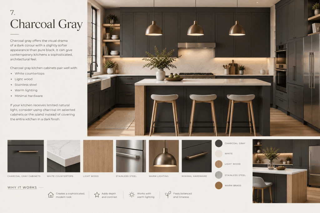
Charcoal gray offers the visual drama of a dark colour with a slightly softer appearance than pure black. It can give contemporary kitchens a sophisticated, architectural feel.
Charcoal gray kitchen cabinets pair well with:
- White countertops
- Light wood
- Stainless steel
- Warm lighting
- Minimal hardware
If your kitchen receives limited natural light, consider using charcoal on selected cabinets or the island instead of covering the entire kitchen in a dark finish.
8. Black as an Accent
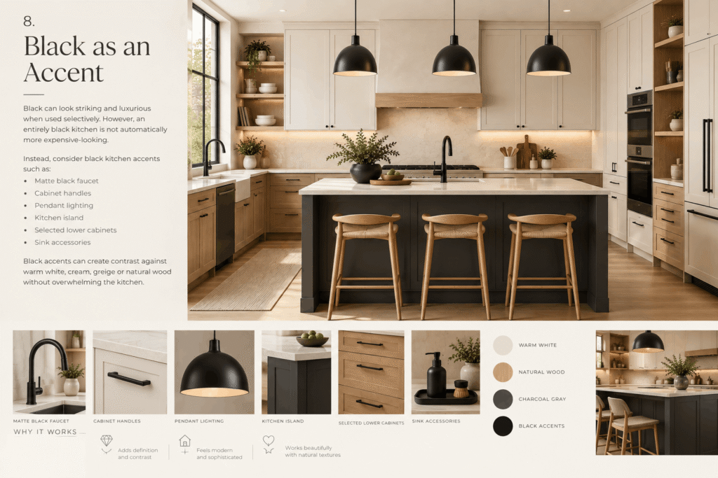
Black can look striking and luxurious when used selectively. However, an entirely black kitchen is not automatically more expensive-looking.
Instead, consider black kitchen accents such as:
- Matte black faucet
- Cabinet handles
- Pendant lighting
- Kitchen island
- Selected lower cabinets
- Sink accessories
Black accents can create contrast against warm white, cream, greige or natural wood without overwhelming the kitchen.
5 Luxury Kitchen Color Combinations That Work
The most successful kitchen color combinations usually contain a dominant colour, a complementary material and a controlled accent.
| Color Combination | Overall Look | Best Paired With |
| Warm white + natural wood | Timeless and warm | Quartz, stainless steel |
| Cream + sage green | Elegant and natural | Brass hardware |
| Navy + white | Classic and dramatic | Light countertop |
| Greige + walnut | Sophisticated and premium | Stone backsplash |
| Black + warm wood | Modern and bold | Brushed metal |
Why Do Two-Tone Kitchen Cabinets Look Expensive?
Two-tone kitchen cabinets create contrast and visual depth. Instead of using one colour throughout the kitchen, you can use a lighter shade for the main cabinetry and a darker or natural shade for the island or lower cabinets.
For example, warm white upper cabinets with natural wood lower cabinets can make a kitchen feel layered without introducing too many competing colours.
How to Choose the Right Kitchen Color
Choosing the right colour depends on more than personal preference. Consider these three factors before selecting your final palette.
1. Consider Kitchen Size
For smaller kitchens, light and warm shades can help create a more open appearance:
- Warm white
- Cream
- Light greige
- Light natural wood
- Soft sage
Larger kitchens offer more flexibility for navy, charcoal, deep green, walnut and black accents.
2. Consider Natural Light
Natural light can significantly change how a colour appears. A shade that looks warm and inviting in a bright showroom may appear darker in a kitchen with limited sunlight.
Before committing to a colour, test a cabinet or paint sample in the actual kitchen during different times of the day.
3. Consider Existing Materials
Your cabinet colour should work with the materials already present in the room, including:
- Countertop
- Backsplash
- Flooring
- Appliances
- Sink
- Faucet
- Cabinet hardware
A coordinated palette generally looks more sophisticated than a kitchen where every element competes for attention.
How to Match Kitchen Colors With Countertops, Backsplash and Hardware
Colour selection becomes easier when you think about the kitchen as one complete composition.
For example:
- Warm white cabinets: Pair with quartz, marble-look surfaces or natural wood.
- Greige cabinets: Pair with warm stone and walnut.
- Navy cabinets: Pair with white or light quartz countertops.
- Sage green cabinets: Pair with cream, white stone and natural wood.
- Wood cabinets: Pair with light neutral countertops and understated hardware.
For hardware, brass and brushed gold can add warmth, while matte black provides stronger contrast. A stainless steel kitchen sink is particularly versatile because its neutral metallic finish can complement both light and dark cabinet colours.
At Anupam Sinks, stainless steel kitchen sinks can be incorporated into a wide range of modern kitchen colour palettes without competing with the cabinetry or countertop.
Which Kitchen Colors Are Timeless in 2026?
If your priority is a kitchen that remains attractive beyond current trends, start with warm white, cream, natural wood, greige and soft green.
These colours can adapt to changing hardware, appliances and decorative styles. Navy, charcoal and black are better used as statement colours when you want additional contrast.
The strongest modern approach is not necessarily to choose the trendiest colour. Instead, create a high-end kitchen color palette that combines timeless foundations with one or two contemporary accents.
Color and Design Mistakes That Can Make a Kitchen Look Less Expensive
No colour is inherently cheap-looking. The problem usually comes from how colours and finishes are combined.
Avoid:
- Using too many competing colours
- Mixing warm and cool undertones without a plan
- Making every cabinet and surface a different finish
- Using too much black in a small, poorly lit kitchen
- Choosing extremely bright colours for the entire kitchen
- Ignoring the countertop and backsplash when selecting cabinet colours
- Using insufficient lighting
- Creating visual clutter on countertops
A simple, coordinated palette can often look more sophisticated than an expensive kitchen filled with unrelated colours and finishes.
Frequently Asked Questions
Q1. What color makes a kitchen look the most expensive?
Warm white, cream, greige and natural wood are among the safest choices for an expensive-looking kitchen. Navy, sage green and charcoal can add sophisticated contrast.
Q2. What kitchen cabinet colors look expensive?
Warm white, creamy white, greige, natural wood, sage green, navy and charcoal can all create an upscale cabinet appearance when paired with suitable countertops and hardware.
Q3. What color combination makes a kitchen look luxurious?
Warm white with natural wood, cream with sage green, navy with white and greige with walnut are reliable luxury kitchen color combinations.
Q4. What colors make a small kitchen look expensive?
Warm white, cream, light greige and light natural wood can make a small kitchen feel brighter and more spacious while maintaining an elegant appearance.
Q5. Are white kitchens still considered luxurious?
Yes. Warm white and creamy white kitchens remain timeless because they work with natural wood, stone, metal and a wide range of hardware finishes.
Q6. Are dark kitchen cabinets a good choice?
Yes, particularly in kitchens with sufficient natural or artificial lighting. Navy, charcoal and deep green can create depth without being as harsh as pure black.
Q7. What kitchen colors are trending in 2026?
Warm neutrals, natural wood tones, muted greens, deep blues and earthy colours are strong choices for modern kitchen colour palettes in 2026.
Final Verdict
If you want the safest expensive-looking kitchen colors, start with warm white, cream, greige or natural wood. For more personality, introduce sage green, navy, charcoal or controlled black accents.
Ultimately, an expensive-looking kitchen is about balance. Coordinate the cabinets with your countertop, backsplash, sink, faucet, lighting and hardware, and even a relatively simple colour palette can create an elegant, high-end kitchen design.